Exhibition Design – Simon Hallows is keeping it simple
“Keep it simple – give your audience one thing to remember, not ten to forget”.
Simon Hallows, Director at Parker Design, recently gave marketers some key exhibition design tips. Simon had received an invite to share his expertise as part of an exhibitions training day at London’s ExCeL, organised by Smart Exhibiting.
For anyone considering an exhibition stand as part of their sales and marketing strategy, Simon suggests you ask yourself three questions.

1. WHY? – Why am I exhibiting?
Why am I considering an exhibition stand? Am I trying to sell my product? Do I want to generate leads? Am I offering my services? Maybe I want to meet my customers? Is my ultimate goal to generate awareness? Or maybe I want to collect data?
2. HOW? – How are we going to achieve it?
By creating intrigue – exhibitors only have a second or two to capture the attention of their audience, so by creating intrigue, you’ll engage them even before they’ve set foot on your stand.
Once you’ve attracted their interest, offer them the option to interact with the stand and your product. The experience is then guaranteed to be more memorable after visitors have walked away. When the show’s over, measure your ROI and gauge whether you should do it again.
3. WHAT? – This is the practical stuff
When you get to the ‘what’, start thinking about how your branding should be applied to the exhibition stand.
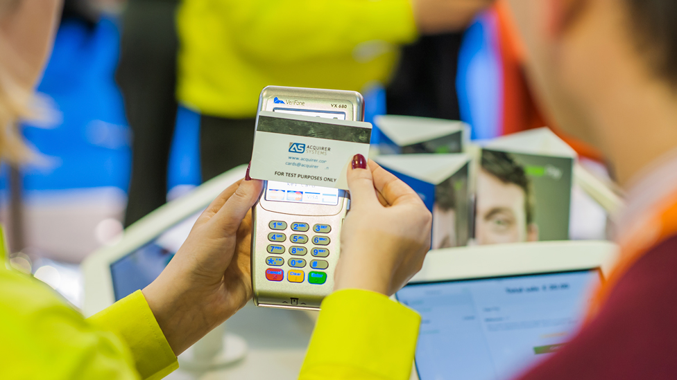
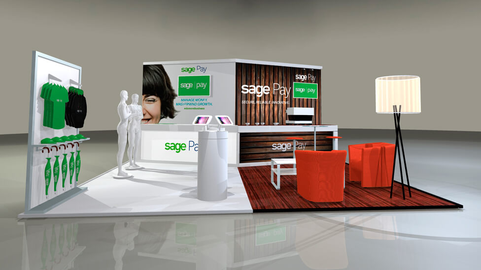
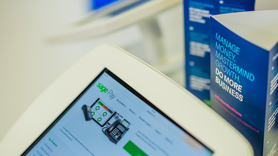
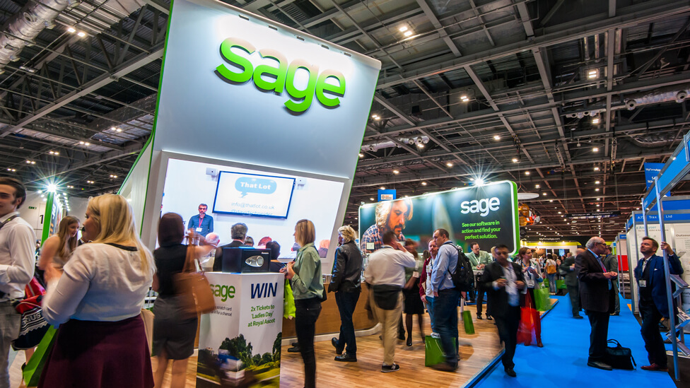
You should also be thinking about product demos, like we did for Sage at the RBTE show.
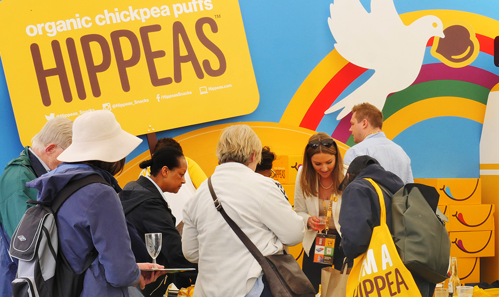
Also, consider if you’ll need to store up promotional materials, or your product, overnight. For the experience we designed for Hippeas, a roof rack and a surf board doubled up as storage.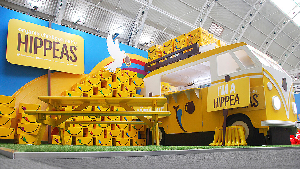
The simplicity and open quality of Balluff’s exhibition stand leaves space for plenty of storage, and encourages visitors to interact with half a ton’s worth of product.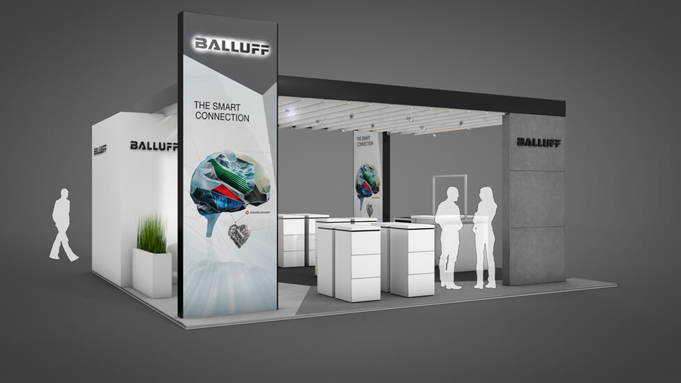
Will you be offering refreshments? Any AV elements?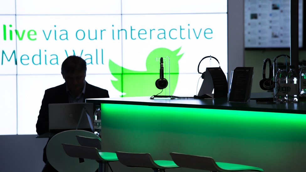
Do you need to include furniture? Do you want visitors to stay for a long time, or do you prefer a constant flow?
Our mobile stand for the University of Northampton was a hit at UCAS events.
Now here’s the fun bit…
Once you can answer the three main questions, the fun starts and you’re ready to start looking at the design of your exhibition stand.
- Wherever possible, and if budget and time allows, work with an experienced exhibition designer – the value they add will be worth the investment.
- Keep your message simple and visible. Will visitors be able to tell at a glance exactly what you do?
- Think of the visitor journey and the flow around your stand. Will people know where to go and who to go to if they have a question?
- Make sure the design and layout are attractive but not intimidating, make people feel welcome.
- Remember to avoid barriers, and not just structural – sometimes those barriers can be human, in the form of an overly eager sales team (!)
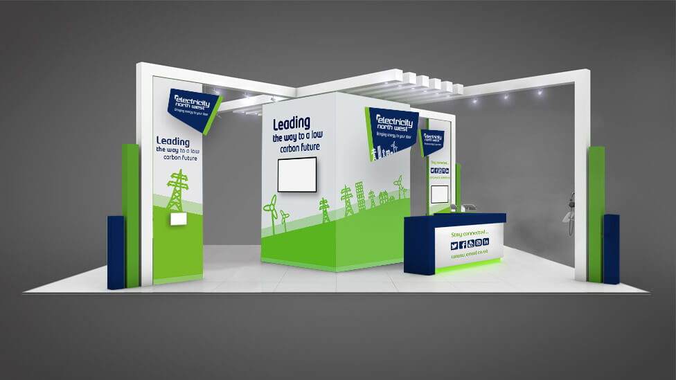
Above – This exhibition stand was an imposing yet open and cost-effective solution for Electricity North West for 2 years running.
Below – This 300sqm stand turned Sage into a beacon at the exhibition hall.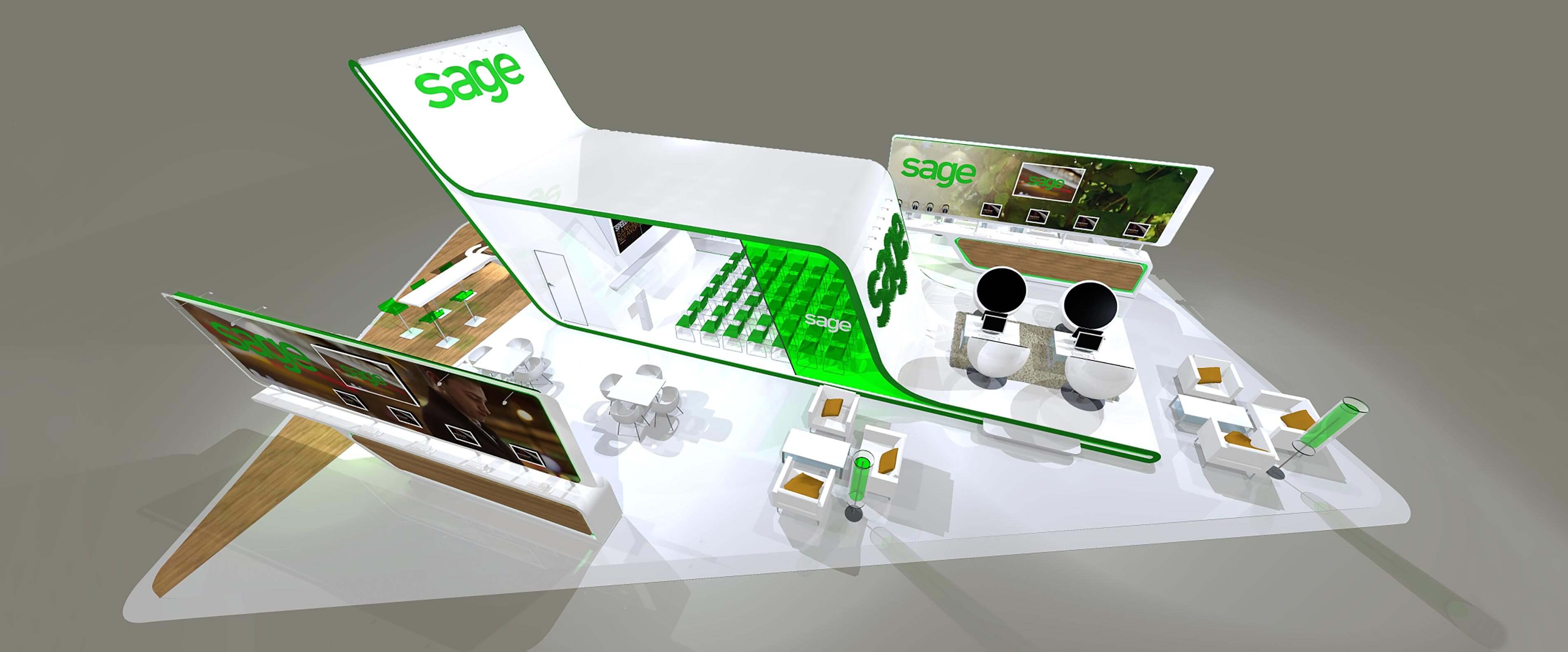
Driving engagement
Once your visitors are in, make sure they stay and engage with you, and your product.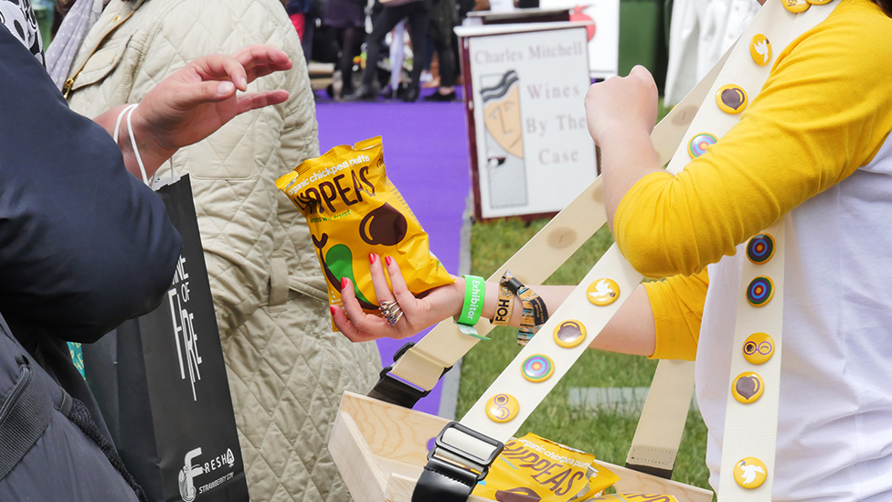
One way to do this is by including interactive elements in your stand that also capture data.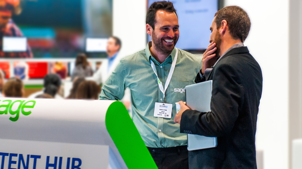
The content hub we custom-built for Sage at Accountex included a 50in touch screen that allowed visitors to swipe, enlarge, move, drag and drop content matching their interests. Delegates were then able to email themselves their own tailored insights pack.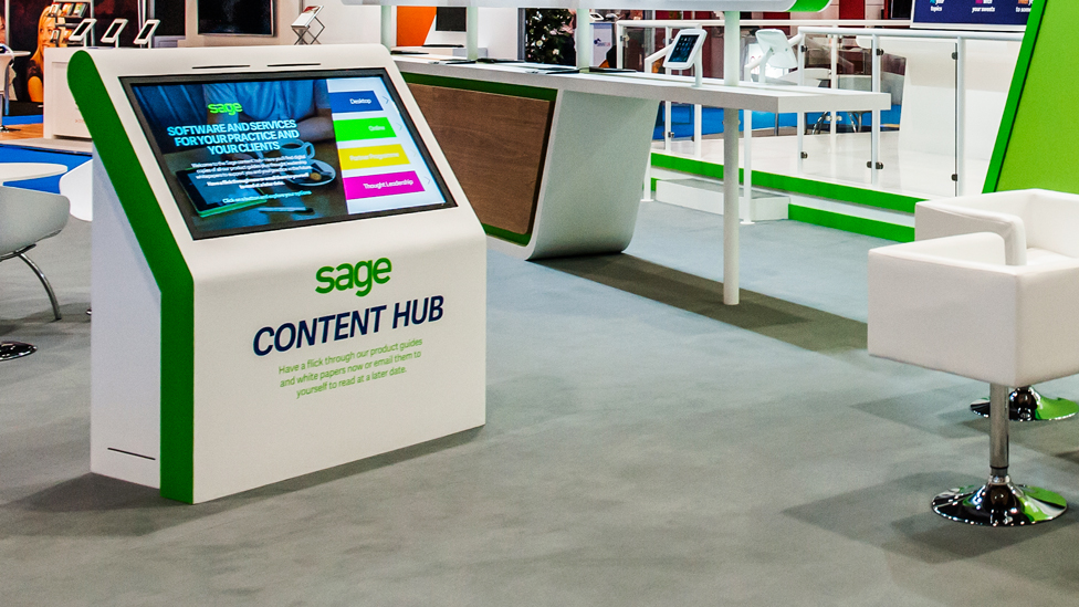
If it’s relevant to your message or product, include games and challenges, and install a leader board – your audience is likely to be competitive and they’ll come back to your stand to see updated results and beat them if necessary.
The experience, and your brand, will be sealed in their minds.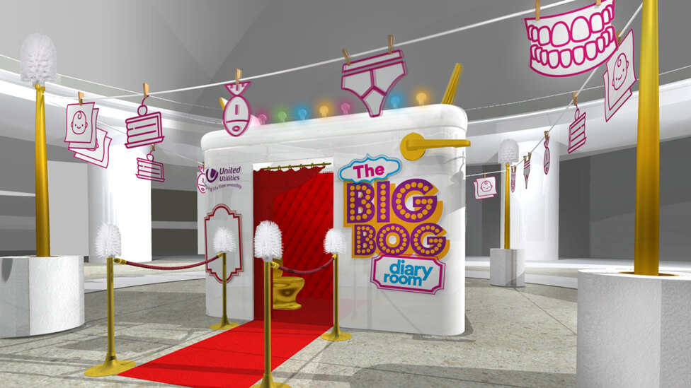
Above – The Big Bog, a fun and memorable way to change the toilet habits of United Utilities’ customers.
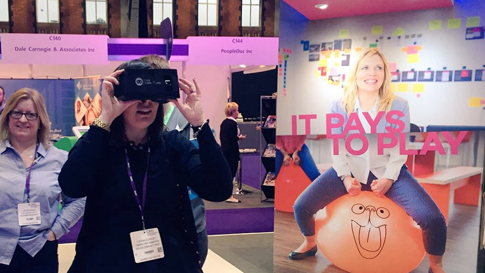
Below – BrightHR demonstrates how the future of HR will look.
Thomson Reuters generate a talking point for EuroFinance attendees.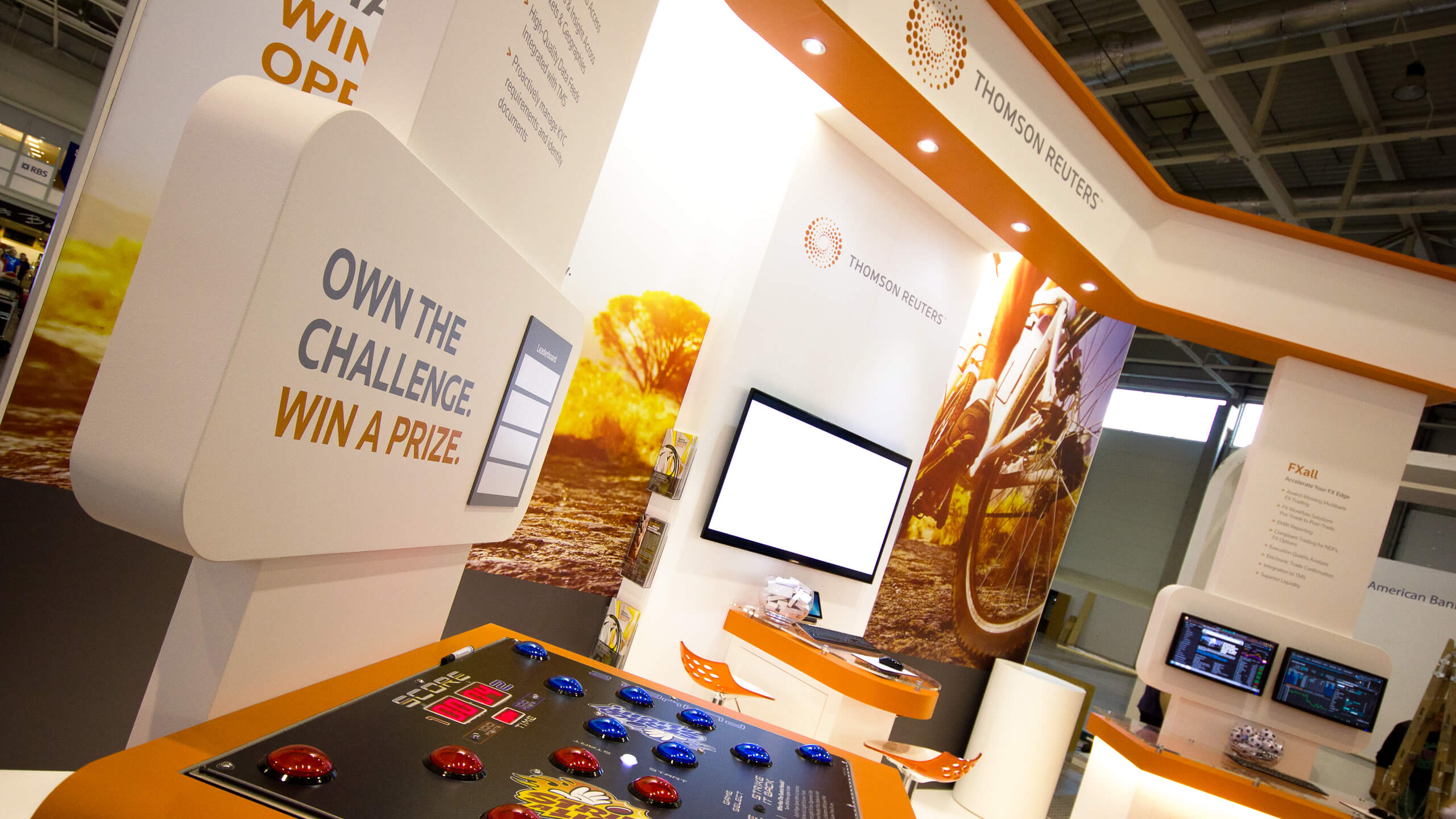
Location, location, location
One of our key exhibition design tips: think of your location within the exhibition hall. There are no bad plots, just bad exhibition design. The stand we built for BrightHR proves it.
Size (and scale) may not matter
If you have the budget, go ahead and dominate the show, like we’ve helped Sage do over the years with a wide range of exhibition stands – below, the double decker exhibition stand design we created for Accountex.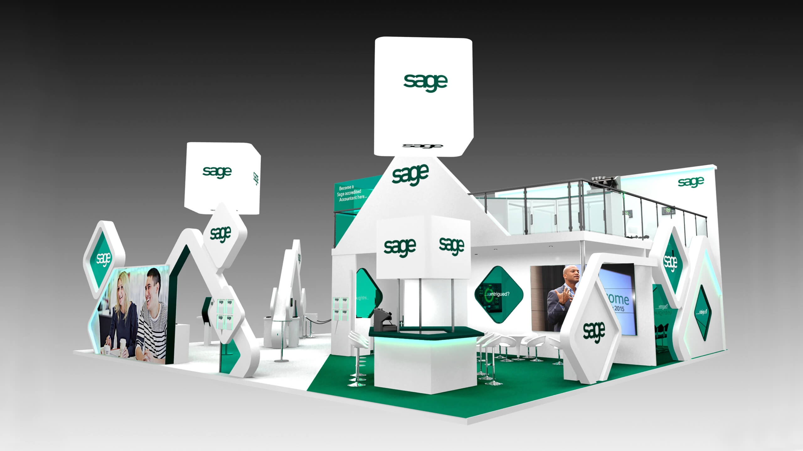
Have your own seminar theatre and you’ll become the hub of the show.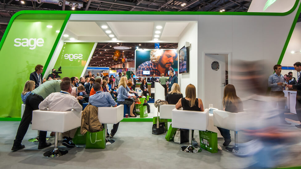
But don’t worry if you don’t have the budget or the space – make it an intimate and personalised experience.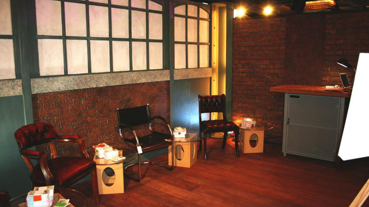
Ultimately, by keeping it simple your exhibition design will deliver on your objectives, and it will give the right message about your brand. It’s what you put on your plot that visitors will take away with them.
These are just a few portfolio highlights, and a few exhibition design tips. For more insights, call Simon Hallows or go over to our Exhibition Design page to see other ways we’ve helped our clients succeed in front of their competitors.
LET'S COLLABORATE
Feel free to give us a call to start a conversation, our doors are always open.